G Collins Brand Identity
Project Overview
G Collins is a house music DJ, producer, and mentor building a personal brand centered around discipline, growth, and creative focus. The objective of this project was to develop a cohesive visual identity that could extend across digital platforms, marketing materials, and live performance promotion.
The final system includes a custom logo, artist photography, branded social media content, and supporting marketing assets designed to establish a recognizable and scalable artist brand.
Graham Collins - Artist
Producer | House Music DJ | Mentor
Primary Typeface
Oskar Inline One Bold
Logo Development
When developing Graham Collin’s logo, I began by selecting a typeface that aligned with the intended aesthetic. From there, I interlocked the “G” and “C” to create a distinctive, custom mark. Using that monogram as the foundation, I refined a complementary type treatment inspired by the original letterforms, resulting in a cohesive and distinctive visual identity.
Brand Elements
A simple visual system was developed to maintain consistency across print, digital, and promotional materials.
Logo Variations
Primary Wordmark
GC Monogram Icon
GC Monogram Icon Outline
GC Stacked Logo
Typography
Primary Typeface — Oskar Inline One Bold
Aa Bb Cc
ABCDEFGHIJKLMNOPQRSTUVWXYZ
Color Palette
Black — #000000
White — #FFFFFF
Accent Blue — #1EA6D6
Primary Wordmark
Brand Application: Business Card
The business card was designed to function as both a networking tool and a digital gateway to G Collins’ growing music presence.
The front establishes a bold, recognizable identity through the GC monogram and high-contrast typography, reinforcing a strong and memorable artist brand. The reverse side prioritizes engagement
by incorporating a scannable QR code that connects directly to his social platforms, making it easy for people to follow his work in real time. The overall design balances minimalism with functionality, ensuring the card remains visually striking while serving a clear purpose within his brand ecosystem.
original
applied logo
original
edited
applied logo
The photography direction focused on creating imagery that felt authentic to G Collins's personality while reinforcing the visual tone of the brand. After conducting the photoshoot, we collaboratively selected the strongest images, which were then professionally retouched and integrated with the brand identity to create cohesive promotional assets.
Photography & Photoshop


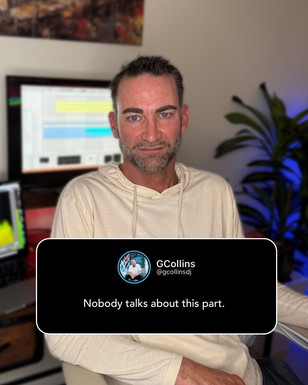
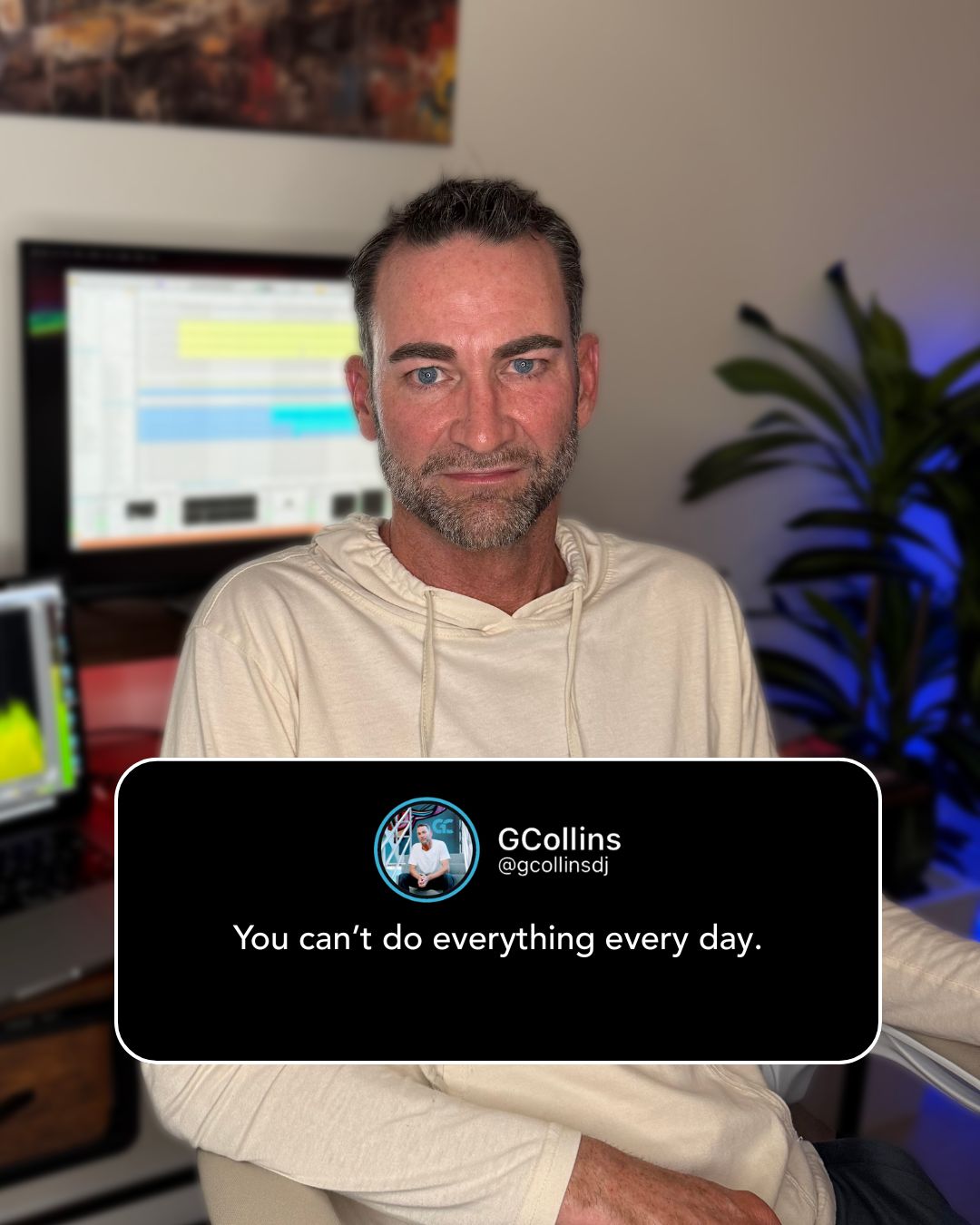
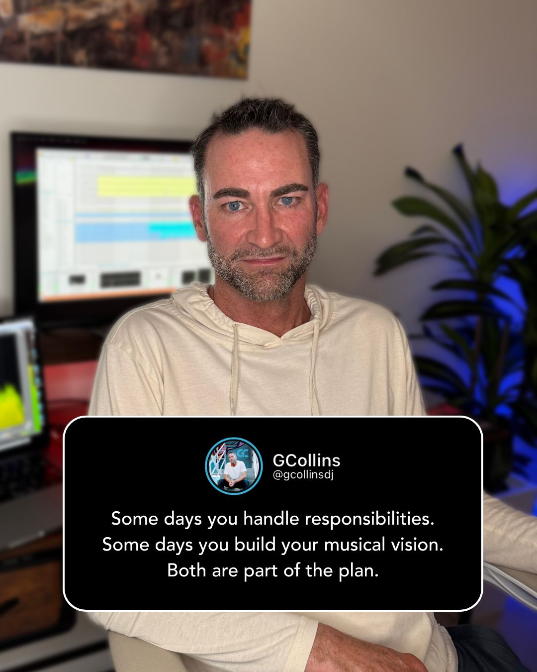
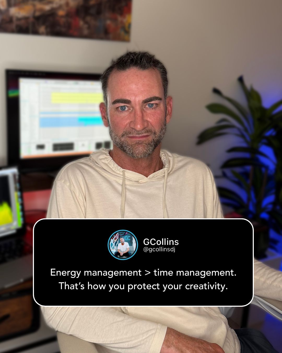
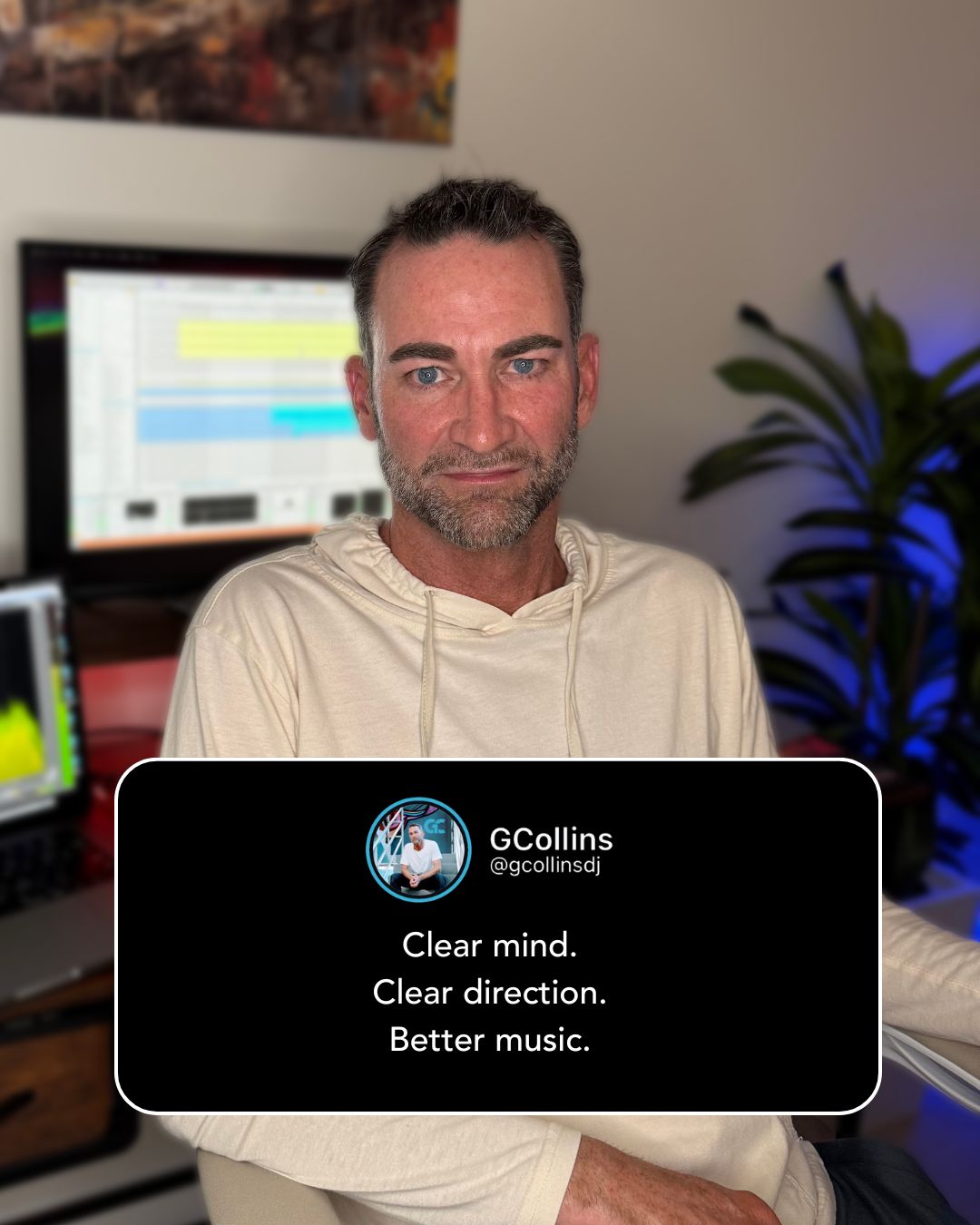
Social Media Story & Post
Continuing the brand rollout, a series of social media assets were developed to support Graham’s content strategy. These visuals combine photography, typography, and brand elements to maintain a consistent identity while supporting storytelling and audience engagement across platforms.
Brand Outcome
The final identity system gives G Collins a recognizable and adaptable brand capable of extending across live events, digital platforms, and marketing materials. By combining typography, photography, and consistent visual language, the brand now communicates both his creative work and his mentorship philosophy: Mind Right. Live Right. Mix Right.